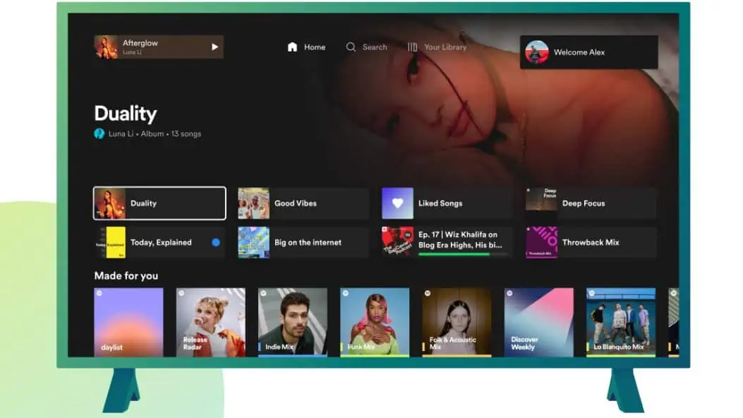
Spotify redesigns its TV experience with new features and improvements which reflect the recent updates to its mobile and desktop apps. The streamer has made it easier to switch between household user accounts, give better visibility on what plays next and a home page primed for discovery.
New Spotify on TV features
- New Home design- The Home page has been redesigned bringing the big-screen experience in line with the Mobile and Desktop apps. You can now easily find familiar shortcuts to favourites, recently played audio, and personalized recommendations right on top of the Home page.
- ‘Up next’ listening queue – Previously it was only possible for TV listeners to view the next song lined up. Now, with the newly introduced Now Playing view, you can better manage your listening session by viewing and controlling what plays next through the easily accessible queue.
- Dark mode – For those occasions where the TV is not meant to be the centre of attention, simply turn on Dark mode through Now Playing view. This will dim the screen and tune down the visuals to display a minimal amount of information.
- Account switching – Since multiple people in your household probably use the TV, account switching is a key feature for TV app users. Spotify has made it easier to switch accounts by always showing the active profile in the top-right corner of your screen. Changing profile accounts can be done at any time by selecting your profile image, keeping the experience tailored to your preferences and listening habits.
A full list of supported devices can be found here.


