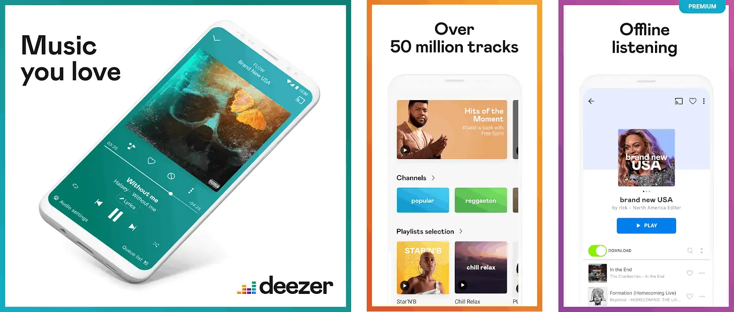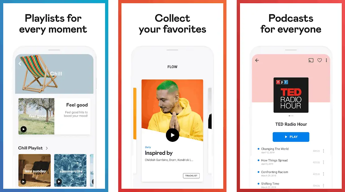
Deezer debuts new look including its mobile apps with improved accessibility and navigation. The new colourful player adapts dynamically to the track being played and displays an updated logo with a modern take on the iconic equalizer and a new font.
The mobile app has been revamped to have more space, less text and dedicated visual treatments for playlists and channels. Deezer’s new player also matches its colour to the cover art of the current track for a truly personal user experience.
Deezer’s logo has also been updated to match the new personality of the brand. It embraces Deezer’s heritage as an industry innovator and updates the iconic equalizer for the digital age.
Hans-Holger Albrecht, CEO Deezer, said, “We want to bring users a modern and human service that stands out from anything else on the market. Our unique look and feel also reflect our mindset as an industry challenger. We help our users create the soundtrack to their lives by bringing them the music they need for any moment.”
The new look Deezer can be found at www.deezer.com or by updating the Deezer app. The Android app can be found here and the iOS app here.

Deezer currently connects 14 million monthly active users around the world to 53 million tracks and is available in over 180 countries worldwide. Deezer is the only music streaming service with Flow, a unique mix of old favourites and new recommendations in one ever-changing stream and based on an intuitive, proprietary algorithm.


